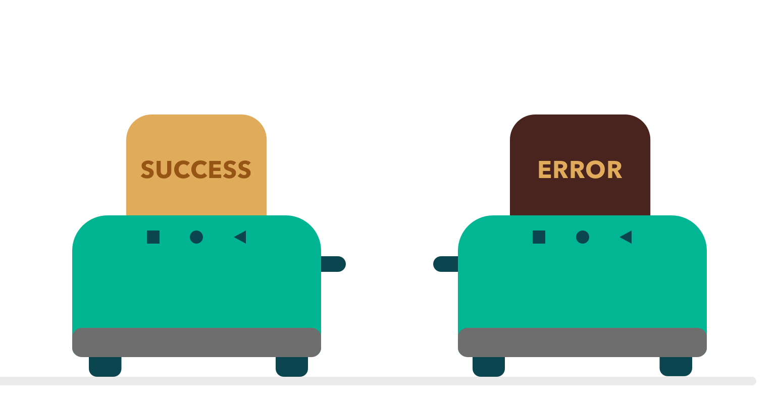

Posting progress or completed status of a particular action is very important for user experience. The user should know at every step what is happening with his taken action in an application. So our obligation as a developer is to take that into consideration when developing and to show status messages in a nice and non-interruptive way.
For this purpose, the guys at Google prepared two nice, clean ways of showing messages. The first and the “oldest” way Toast, which has been presented in Android APIs from the beginning of TIME. The other alternative is Snackbar, which was added to the support library.
In this article, we will focus on Toasts – when to show them and how to customise them. It’s very important to notify the user of his progress in an application and to show in a convenient way when an action is completed. For instance, let’s take a look at communication with some online services. The progress of communication is usually shown with progress indicators such as a progress bar, progress dialog or maybe a pull-to-refresh component. But after the job is finished, we have to show the user the successful result, or error, in communication. This is our opportunity to use Toasts as a status message for completed communication. Some of you are gonna say that there are other ways to show successful/failed completed tasks, that we should show status somewhere on the screen where the task was performed. You could not be more correct! If you can show completed task in your UI, you should definitely do it. But there are some cases where we can’t do it like this. For example, if we have some tasks that are processed on the back thread, separately from the main thread, or the user may use the app further and move from the screen where they performed the action. In that case, we need to look other alternatives for showing completed status. The simplest, fastest and cleanest way is to use Toast. So take time and think through what is better for every single case you have and bear in mind that the user expects flawless interaction with an application. If we do decide to show a Toast message, all we have to do is to write this part of code:
and the message is shown immediately, as in this image :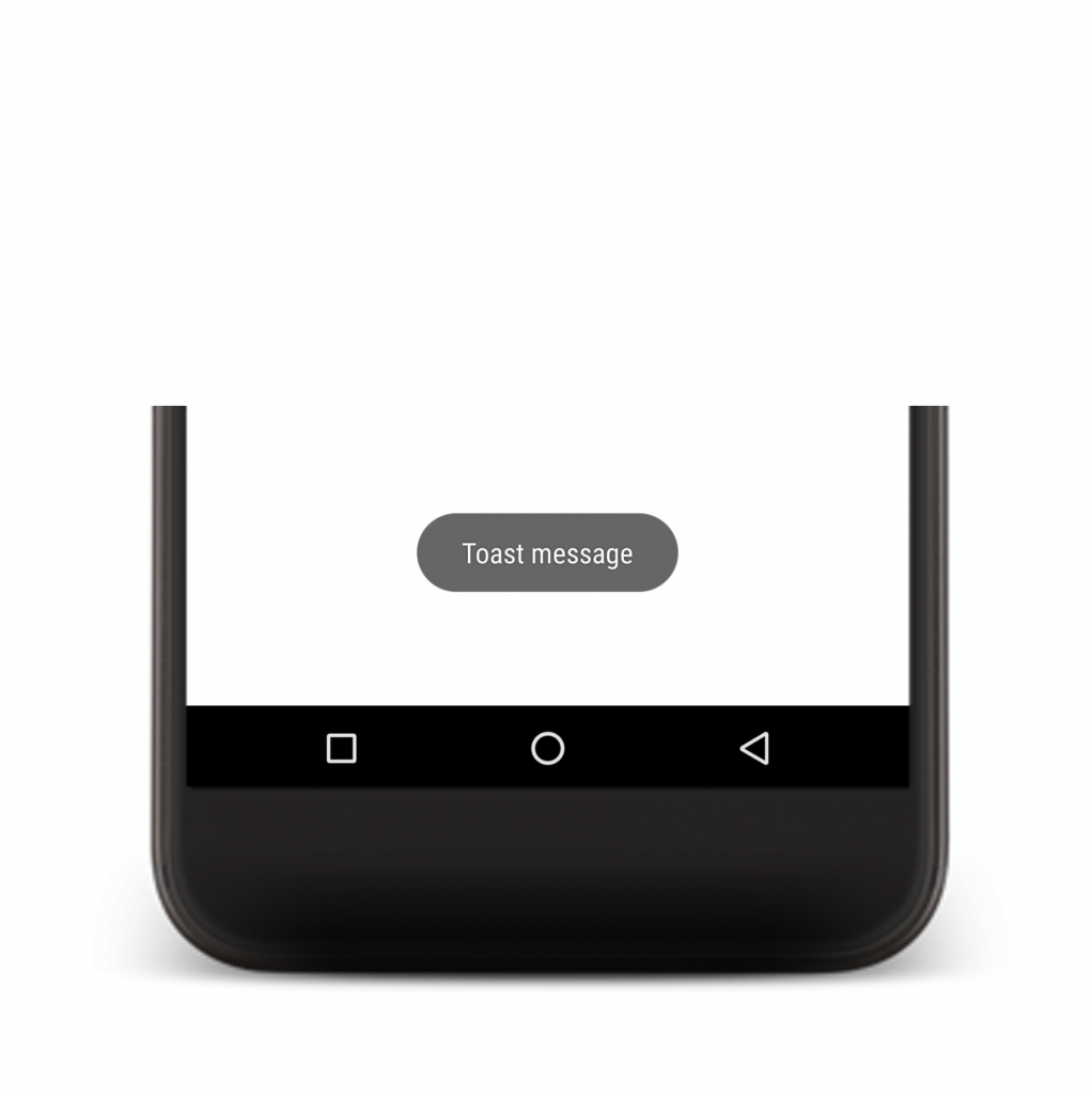
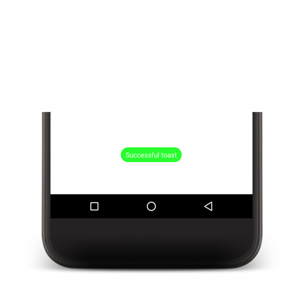
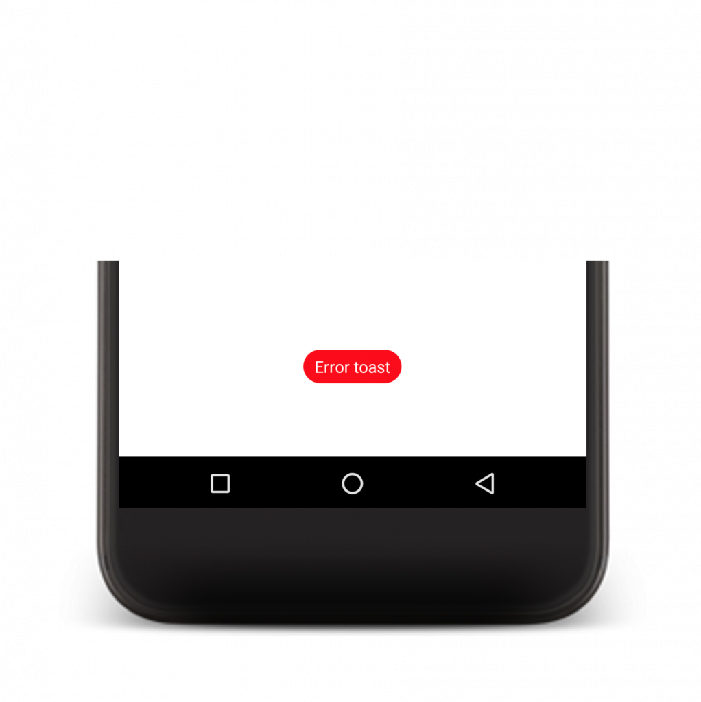
It looks good. Now imagine you use Toast all over the app for all successful and failed statuses. It gets quite boring, don’t you think? And when Toast is shown, the user has to read the Toast message to see what has happened. We people can be very lazy sometimes, so if we can do something about it, then let’s do it! It would be nice to see at first glance which type of Toast message has displayed, so why don’t we create our own Toast that will tell a user at first look if it’s a successful or failed message. First thing that we have to do is create a custom layout in XML. Our layout will have only one TextView, which will show a message. For this example, we have used Data Binding Library (more info: https://developer.android.com/topic/libraries/data-binding/index.html) and ConstraintLayout Library (more info: https://developer.android.com/training/constraint-layout/index.html):
Now we have to use this layout to set the properties as we want them and add it to the Toast content. For this purpose, we are going to create a class with the static method for creating Toast. In this method, we will receive the context in which a Toast message must be shown, message to be shown, duration of Toast and background colour of the Toast message. This is all done in the next function:
A layout is inflated by the Data Binding Library with DataBindingUtil class. With binding variables we can access all views that have a set id, so we can set the message to our TextView component and background colour to our Toast view. Additionally, we can set corner radius with GradientDrawable so that our Toast has a similar shape to the system Toast message. Converting dp to px is performed with convertDpToPixel(float sizeInDp).
After all that we are ready to set our Custom Toast view as background to system Toast with setView(View view) function on the Toast object. Now our Custom Toast is ready to be used. Below we have two example of using Custom Toast:
Summary
As we can see, it’s not hard to create Custom Toast views. With a little effort, we can add to our application a neat way of showing a message with Toast. Here I have only briefly shown what can we do with Toast. From here you could continue to develop more types of Toast message, for example, error, warning, success, info or some other types of Toast. You can create a more complex layout in the XML file and then maybe consider using BuilderPattern(more info: https://en.wikipedia.org/wiki/Builder_pattern) for creating Toast messages, but I suggest to not overreact with this. Keep it simple and close to the default Toast look. It’s enough to add background colour and maybe an image before the message to give your app a completely new look. Also, think about where are you going to use Toast messages – some information could be shown with components that are already visible on the screen.
Feel free to comment and share your thoughts on this article.
You can find the whole project here:
https://github.com/equaleyes/custom-toast
